Featured

Introduction

Welcome to Tanaijah’s blog. My name is Tanaijah Fields. I attend Illinois State University as a junior after transferring from Ball State University Spring semester of my Freshman year. I am a Fashion Design and Merchandising major. I have been interested in fashion since I was about four years old. I started coming up with my own designs and putting together different outfits to create a new look. I always knew it would be something that stuck with me and I would use as my future career.

Over the years, I found many of my strengths and weakness, both personally and professionally. I am very creative. I can coming up with new and exciting solutions on the spot for any situation. This is both a strength and weakness, it comes in handy when I’m on a time crunch but also makes me think too much on certain situations that can have a simple solution. I also have a weakness with public speaking but creating presentations and typing out ideas come naturally for me.

I have previously worked in retail at “The Children’s Place” and did a summer internship at “Chic Treasures” boutique. This experience has helped me enhance my communication skills and know how different it is to operate a big corporate store compared to a small store boutique. These two experiences have allowed me to achieve a status of helping prepare a concept for a window display and run the social media pages to enhance promotion. After working in both stores and working continuously on designs, I decided that my career goal will be to work in a bridal boutique and help style people for their special day.

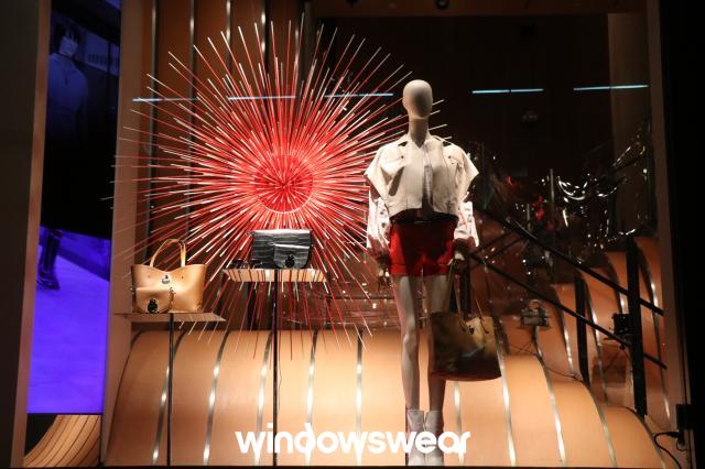
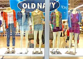
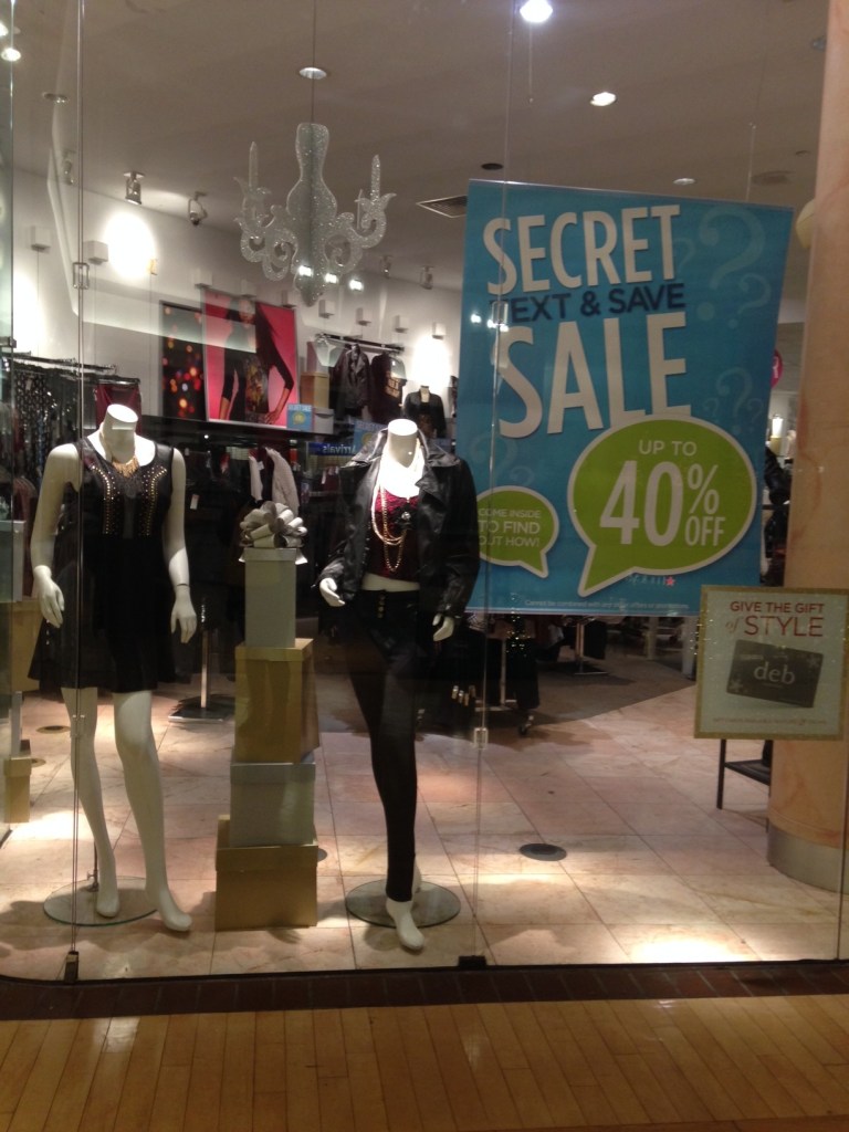
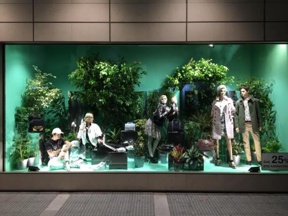
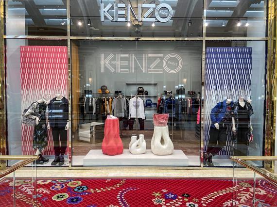
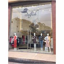
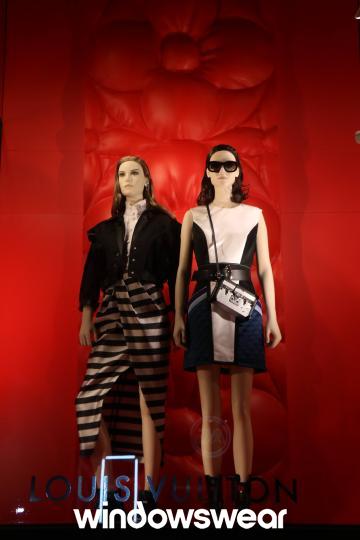
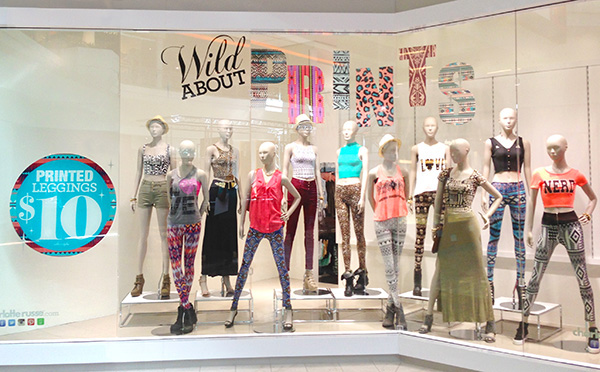
Overall, this blog is intended to show how I analyze various fashion window display photos over the course. It will incorporate any knowledge gained from Fashion Promotion over time and enhance in detail the further along we get.

Be yourself; Everyone else is already taken.

— Oscar Wilde.

Visual Merchandising Analysis 4

Good

This window portrays so much balance and harmony. Along with that, there’s a hint of surprise in the display as well. Looking at the display gave me summer vibes, showing me something that can be worn for the Fourth of July and can be matched with multiple choices of handbags. The surprise element comes from the firework prop in the background and the floor looking like a stairwell behind the overall display.

Color helps communication between the shopper and the retailer. The color shows the story of what time of year the merchandise is specifically in use. The display is fixed by functional grouping, having the most important end-use on one side and the clothing (that they are least focused on in this case) on the other side. While the skirt is a bold red matching the color of the firework, the accessories to go with it are in a more neutral color so it doesn’t take away from the overall outfit.

Lastly, the lighting. The way they have the lighting set up shows the direction the eye is supposed to go in. By that I mean, the brightest part of the display is shining over the handbags, telling shoppers that is what the merchandisers want them to notice first. The eye always starts off at the brightest location and travels to the dimmest. The display shows what the store wants to sell and pairs it with what goes nice but doesn’t show much light on what the accessories match with in terms of the apparel.

Bad

Old navy is known for a variety of clothing at a convenient price, which is what everyone adores about the store. The display does show everything the store has to offer but the clothes aren’t presented in a way that they would sell themselves.

Color always plays an important and key role when it comes to window displays. The problem with the color in this window is that there is too much of it that it doesn’t even tell a story to intrigue the shoppers. There is no line or direction to guide the eye, there are so many directions to look the eye doesn’t lead from one location to the next to have a set mood. They can also improve the display with emphasis and contrast to enhance the direction of the shopper’s eye.

Visual Merchandising Analysis 3

Bad – Deb

This window display can use a little more work. The display uses lighting that is very dull and hard to see. I like the choice of clothing and the harmony between the colors but it is hard. There has to be some emphasis to catch the eye of the person walking by. The display lacks the building of the brand because it doesn’t fully show me what the store has to offer.

The most important part of the display is making sure people can see the display. The window lighting has minimum accent lighting but still is not bright enough to be seen. there is a lot of empty space going on in the display as well. Although it is being covered up with promotional signs so it won’t look as empty it could be more presentable and make a person linger longer. I would add more accent lighting to cover both mannequins. I would also space them out more and create more balance.

By doing that, I would move the promotional sign to the middle and have the clothing surrounding it and have the props off to the sign just to add more to the brand image and the image of the product. This will allow the new merchandise to be highlighted and attract more people into the store.

The good – Windowswear

This jungle themed window attracted my attention with the way the lighting is set up and the background to match it. The use trees display the theme of the display really well and shows exactly what the store is aiming for when having people stop to look at it.

The display has a few props that helps emphasis the overall theme of the display and present the clothing store with their trend area of merchandise. the display has different shades and tints of green to make it more realistic. The trees also adds texture while the choice of clothing adds tension. when thinking of the jungle one doesn’t usually think of women wearing active wear but more of a cheetah print attire. The active wear represents the more memorable portion of the display representing the tension or surprise element. The story told here all has to do with having a trip to the jungle to explore and be prepared for any kind of weather by having the appropriate attire, which all comes from shopping in the store of the displayed window.

Visual Merchandising Analysis 2

Kenzo – the good

I particularly love this window display. The messages in the display sends the receiver the idea that the store sales casual everyday clothing to it’s customers. The color scheme consists of 2 primary colors, red and blue, and the neutral colors of white and black to make a calming display. The red in the background appears as a different shade than the red in the stand and the color on the bag. There is a tint in the red of the purse and the stand. The blue follows the same pattern having a shade in the blue background and a tint in the blue jacket. The white is a great neutral color so it doesn’t take away from what the display is trying to sale.

The handbags that are displayed bring out a texture along with the background. It makes the eye know how the surface will feel before going into the store. It also shows the optical weight of the bags and even the clothing itself. When looking at the visual display, one can see the dresses that are presented are made of a lightweight fabric that flows in the wind because the fabric is sheer and draping. The proportion throughout the display is so well balanced it creates a perfect flow of direction. its not too much for the eye to notice and has enough negative space for the eye to take a small rest before taking in another item that is being sold.

Selfish – the bad

The store selfish has so many edgy clothes to offer. It sales more trendsetting clothing but it’s not being displayed by the visual display. Although it does have some good qualities, it can still use some work to make it better. While having negative space is always a good idea to give the eye a break. It is important to keep some kind of balance that will fill the space. This particular display, has informal balance but still doesn’t fill the display fully. The mannequins alone can sell the clothing, but the positioning of them has the eye feeling a little off balance especially with the set of empty poles in the middle of the display.

This visual is easier to walk past because it doesn’t capture the eye to intrigue the buyer to want to come in and shop. Since the window is so simple it could use some tension and emphasis to create a focal point and capture the eye to attract more customers. the light intensity can be adjusted so it doesn’t clash against the lighting outside and make it harder to see the products being sold. They should use color to create a flow of direction and using the color as a strategy to make a story helping the brand sale.

Visual Merchandising Analysis 1

The Good

Louis Vuitton has a good display to promote his line. The color of the display is really effective. He has a great flow of color making the display catch the eye of the customer passing by. The color of the attire flows together coming from the same color schemes at different values. Taking that into consideration the red background really makes the attire stand out more to the watcher’s eye. The intensity of the lighting brings it together having it bright enough to see but not too bright that it will make the person passing by turn around. Instead the lighting is intriguing, making you want to look more into the display and take notice into how the theme all flows together to look like a typical day or even night out in the town.

The proportion and balance of the mannequins are also amazing. It is important that the display flows together and not have too much going on to take away from what the display is suppose to sell to the customers. The mannequins are centered in the middle of the window side by side with a bow indented on the backdrop representing the slightly unequal relationship of size. The bow maintains balance because it doesn’t fully stand out to take away from what the display is trying to sell.

When first looking at this display, I felt that the display was to show contrast between clothing during the day and for going out in the evening. Looking at the display, one woman is wearing sunglasses and a shorter length dress which can indicate day while the woman on the left is wearing a slightly longer dress without sunglasses, indicating more of an evening effect. It could also be taken as a contrast between the attire of two friends showing how it would look with the attires coming together in the same setting. the display is appealing to customers because of this contrast.

Overall, the display is creative and promotes the clothing products that Louis Vuitton is trying to promote. It enhances that the store is more elegant but can be used as day to day fashion and appeals to the customers.

The bad

This image has an empty alt attribute; its file name is bad.jpg

Charlotte Russe on the other hand could use some improvement for their window display. While the color detail is nice, it doesn’t have any harmony or unity. Looking at this window display, I thought about how the design of elements are meant to create a shopping environment that is pleasing to the eye. This display actually is the opposite. Looking at it I felt that the store’s atmosphere is going to be crowded and cluttered with no sense of balance. The display still has some emptiness to it that was meant to be taken up by the giant sticker on the window.

While color is a great communication tool, this display has too much color that clashes together and doesn’t flow together to tell a story. The eye wouldn’t know were to start when looking at the display making it easier to lose interest and walk away faster. After learning that direction and line both play a role in the display strategy, its been more noticeable that people display their windows to be delicate to the eye and sets a good mood. Charlotte Russe, on the other hand, didn’t display this particular window to guide the eye to a particular feature or even divide the colors used into separate groups to have a calming flow.

Overall, the display does show that the store has a lot to often. The various colors and styles in the display can appeal to customers by informing them that the store doesn’t focus on just one brand or style of clothing but can meet any needs of the consumer. They promote all of attire at once and enhance their store’s image.

Design a site like this with WordPress.com
Get started