Good
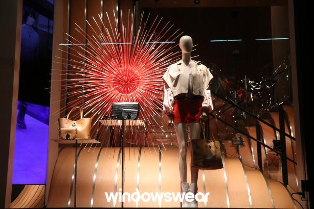
This window portrays so much balance and harmony. Along with that, there’s a hint of surprise in the display as well. Looking at the display gave me summer vibes, showing me something that can be worn for the Fourth of July and can be matched with multiple choices of handbags. The surprise element comes from the firework prop in the background and the floor looking like a stairwell behind the overall display.
Color helps communication between the shopper and the retailer. The color shows the story of what time of year the merchandise is specifically in use. The display is fixed by functional grouping, having the most important end-use on one side and the clothing (that they are least focused on in this case) on the other side. While the skirt is a bold red matching the color of the firework, the accessories to go with it are in a more neutral color so it doesn’t take away from the overall outfit.
Lastly, the lighting. The way they have the lighting set up shows the direction the eye is supposed to go in. By that I mean, the brightest part of the display is shining over the handbags, telling shoppers that is what the merchandisers want them to notice first. The eye always starts off at the brightest location and travels to the dimmest. The display shows what the store wants to sell and pairs it with what goes nice but doesn’t show much light on what the accessories match with in terms of the apparel.
Bad
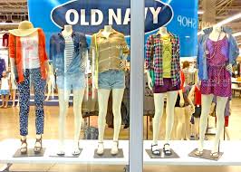
Old navy is known for a variety of clothing at a convenient price, which is what everyone adores about the store. The display does show everything the store has to offer but the clothes aren’t presented in a way that they would sell themselves.
Color always plays an important and key role when it comes to window displays. The problem with the color in this window is that there is too much of it that it doesn’t even tell a story to intrigue the shoppers. There is no line or direction to guide the eye, there are so many directions to look the eye doesn’t lead from one location to the next to have a set mood. They can also improve the display with emphasis and contrast to enhance the direction of the shopper’s eye.
