Kenzo – the good
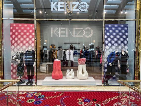
I particularly love this window display. The messages in the display sends the receiver the idea that the store sales casual everyday clothing to it’s customers. The color scheme consists of 2 primary colors, red and blue, and the neutral colors of white and black to make a calming display. The red in the background appears as a different shade than the red in the stand and the color on the bag. There is a tint in the red of the purse and the stand. The blue follows the same pattern having a shade in the blue background and a tint in the blue jacket. The white is a great neutral color so it doesn’t take away from what the display is trying to sale.
The handbags that are displayed bring out a texture along with the background. It makes the eye know how the surface will feel before going into the store. It also shows the optical weight of the bags and even the clothing itself. When looking at the visual display, one can see the dresses that are presented are made of a lightweight fabric that flows in the wind because the fabric is sheer and draping. The proportion throughout the display is so well balanced it creates a perfect flow of direction. its not too much for the eye to notice and has enough negative space for the eye to take a small rest before taking in another item that is being sold.
Selfish – the bad
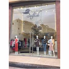
The store selfish has so many edgy clothes to offer. It sales more trendsetting clothing but it’s not being displayed by the visual display. Although it does have some good qualities, it can still use some work to make it better. While having negative space is always a good idea to give the eye a break. It is important to keep some kind of balance that will fill the space. This particular display, has informal balance but still doesn’t fill the display fully. The mannequins alone can sell the clothing, but the positioning of them has the eye feeling a little off balance especially with the set of empty poles in the middle of the display.
This visual is easier to walk past because it doesn’t capture the eye to intrigue the buyer to want to come in and shop. Since the window is so simple it could use some tension and emphasis to create a focal point and capture the eye to attract more customers. the light intensity can be adjusted so it doesn’t clash against the lighting outside and make it harder to see the products being sold. They should use color to create a flow of direction and using the color as a strategy to make a story helping the brand sale.
