The Good

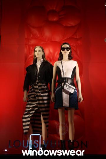
Louis Vuitton has a good display to promote his line. The color of the display is really effective. He has a great flow of color making the display catch the eye of the customer passing by. The color of the attire flows together coming from the same color schemes at different values. Taking that into consideration the red background really makes the attire stand out more to the watcher’s eye. The intensity of the lighting brings it together having it bright enough to see but not too bright that it will make the person passing by turn around. Instead the lighting is intriguing, making you want to look more into the display and take notice into how the theme all flows together to look like a typical day or even night out in the town.
The proportion and balance of the mannequins are also amazing. It is important that the display flows together and not have too much going on to take away from what the display is suppose to sell to the customers. The mannequins are centered in the middle of the window side by side with a bow indented on the backdrop representing the slightly unequal relationship of size. The bow maintains balance because it doesn’t fully stand out to take away from what the display is trying to sell.
When first looking at this display, I felt that the display was to show contrast between clothing during the day and for going out in the evening. Looking at the display, one woman is wearing sunglasses and a shorter length dress which can indicate day while the woman on the left is wearing a slightly longer dress without sunglasses, indicating more of an evening effect. It could also be taken as a contrast between the attire of two friends showing how it would look with the attires coming together in the same setting. the display is appealing to customers because of this contrast.
Overall, the display is creative and promotes the clothing products that Louis Vuitton is trying to promote. It enhances that the store is more elegant but can be used as day to day fashion and appeals to the customers.
The bad

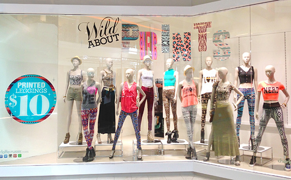
Charlotte Russe on the other hand could use some improvement for their window display. While the color detail is nice, it doesn’t have any harmony or unity. Looking at this window display, I thought about how the design of elements are meant to create a shopping environment that is pleasing to the eye. This display actually is the opposite. Looking at it I felt that the store’s atmosphere is going to be crowded and cluttered with no sense of balance. The display still has some emptiness to it that was meant to be taken up by the giant sticker on the window.
While color is a great communication tool, this display has too much color that clashes together and doesn’t flow together to tell a story. The eye wouldn’t know were to start when looking at the display making it easier to lose interest and walk away faster. After learning that direction and line both play a role in the display strategy, its been more noticeable that people display their windows to be delicate to the eye and sets a good mood. Charlotte Russe, on the other hand, didn’t display this particular window to guide the eye to a particular feature or even divide the colors used into separate groups to have a calming flow.
Overall, the display does show that the store has a lot to often. The various colors and styles in the display can appeal to customers by informing them that the store doesn’t focus on just one brand or style of clothing but can meet any needs of the consumer. They promote all of attire at once and enhance their store’s image.